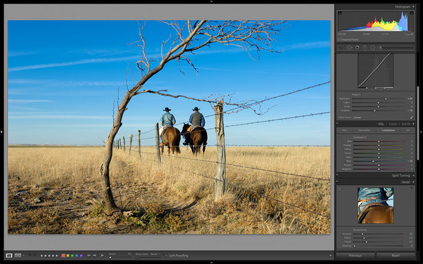
The Tone Curve panel (as shown in the photo below) is yet another incredibly intuitive tool within the Adobe Photoshop Lightroom Develop module. As I alluded to when discussing the Contrast slider in a previous blog post about the Tone Sliders, I use the Tone Curve panel to add contrast to my images instead of using the Contrast slider in the Basic panel. The Tone Curve panel allows me to very carefully adjust the contrast in the image with great precision because I can control the highlights, mid-tones, and shadow areas with the Highlights, Lights, Darks, and Shadows sliders. If you have ever used the Curves feature in Photoshop, this panel will be very intuitive.
Tone Curve Panel in Lightroom
The Tone Curve Panel is located just under the Basic Panel, as outlined in red in this screenshot.
Tone Curve Sliders
Right off the bat, you’ll notice that each slider affects only a certain part of the curve. If you mouse over the curve you’ll notice that the sliders light up depending on which part of the curve you mouse over. You will also notice that a bubble around that section of the curve turns light grey as in the photo below. If you click in the shadows section of the curve, you’ll notice that the "Shadows" slider lights up slightly brighter than the others, and also a bubble around the shadows area of the curve turns light grey.
Similarly, if you click on the lower left part of the curve the "Darks" slider is illuminated; and if you click in the highlights section of the curve, the "Highlights" slider illuminates and the curve is surrounded by the grey bubble, which shows how far you can affect the curve. This works with all of the tone curve sliders so that you can visually see which part of the curve you are manipulating and how those changes will affect the image.
In this screenshot, we see the Tone Curve panel in detail. Note that there are four sliders that can affect the tones and contrast in the image: Highlights, Lights, Darks, and Shadows. Here I have my mouse over the Lights section of the tone curve, and the light grey areas surrounding the tone curve show how far I can manipulate the curve.
Tone Curve Markers
In addition to the Tone Curve sliders, you can also move the markers just under the curves window so that you can constrain the area of the curve that is affected (see the photo below). At their default, these markers are spread out in 25% increments across the bottom of the curve. In photo below, I have chosen to limit the highlight slider’s effect to only the top 10% (100% - 90 = 10%) of the curve.
Here, I have chosen to limit the highlight slider’s effect to only the top 10% (100% - 90 =10%) of the curve by moving the bottom marker over to 90. Similarly, you can move the other two markers to constrain or enlarge other areas of the histogram that are affected by the tone curve sliders.
Preset Tone Curves
If you prefer to use preset curves, those are also available in Lightroom. Simply click on the toggle at the bottom of the Tone Curve panel named "Point Curve" and the familiar three choices will appear: Linear, Medium Contrast, and Strong Contrast. I normally don’t use this toggle that often because I can easily adjust the contrast here in the Tone Curve panel by moving the sliders or with the Contrast slider in the Basic dialog. Every once in a while, an image comes in that has a lot of contrast, and that is the one case where I might change this toggle to Linear.
Setting Your Own Tone Curve Panel
In general, with all of my images, I add some mid-tone contrast by setting the Lights slider to +10 or so and the Darks slider to -6 or so. There are no hard and fast rules as to how far I go with each of these sliders. I adjust the Lights and Darks sliders individually to taste. Also, note that these four sliders are roughly equivalent to the Highlights, Shadows, Whites, and Blacks sliders in the Basic panel. Hence, if you adjust the Highlights or Shadows sliders here in the Tone Curve panel, you might end up clipping either the whites or the blacks in your image. I tend not to adjust the Highlights or Shadows sliders that often in the Tone Curve panel as I can adjust those parts of the image with more accuracy in the Basic panel above. When working up black and white images, I will adjust all four of these sliders to add contrast to the image and to adjust the tones.
 John Fullbright throwing cartwheels and surfing in Sleeping Beauty on the Rio Grande in northern New Mexico.
Here is the finished image with the Tone Curve panel adjustments.
As you can see, Lightroom offers incredible control of the tone curves in an intuitive manner—one which works for both experts and beginners. And just in case you were wondering what that target-like circular icon in the upper left corner of the Tone Curve panel is, it is called the Targeted Adjustment Tool. We’ll talk about the Targeted Adjustment Tools later in another blog post since they appear in several sections of the right panel. Stay tuned!

This blog post is a modified excerpt from my e-book, Adobe Photoshop Lightroom: A Professional Photographer’s Workflow. For more information on this e-book or to purchase the e-book please visit my website.
KEEP UP WITH MICHAEL:
Website | Blog | Workshops | Facebook | Twitter | Instagram |
Google+ | Behance


